Brand Evolution / Visual System Refresh
Wings of Strength Brand Evolution (Neon Identity System)
PROJECT OVERVIEW
Wings of Strength operates within a global bodybuilding ecosystem, producing multiple events that lead competitors toward qualification for the Mr. Olympia. Each show contributes to a larger narrative—one built around strength, discipline, and elite performance.
For the 2024–2025 season, I was tasked with evolving the existing brand identity in a way that would unify all outward-facing media. This included digital campaigns, large-format print, and broadcast visuals across multiple events and locations.
The objective was not to replace the brand, but to re-energize it—to create a more visually striking and cohesive identity system that could elevate the perception of the organization while maintaining its established recognition.
THE CHALLENGE
The primary challenge was restraint.
The Wings of Strength logo was already a recognized symbol within the industry. Any major deviation risked weakening that recognition. At the same time, the existing presentation lacked the visual energy needed to stand out across modern media channels.
The solution required a balance:
- Maintain the integrity of the original mark
- Introduce a fresh, compelling visual language
- Ensure the system could scale across multiple formats and environments
This wasn’t about redesign—it was about transformation without loss of identity.
MY ROLE
- Concept development and visual direction
- System design across digital and physical environments
- Production-ready asset creation for print and motion
- Cross-functional coordination with marketing and event teams
EXECUTION
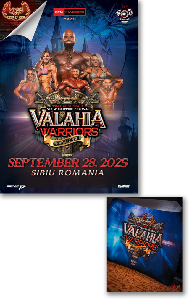
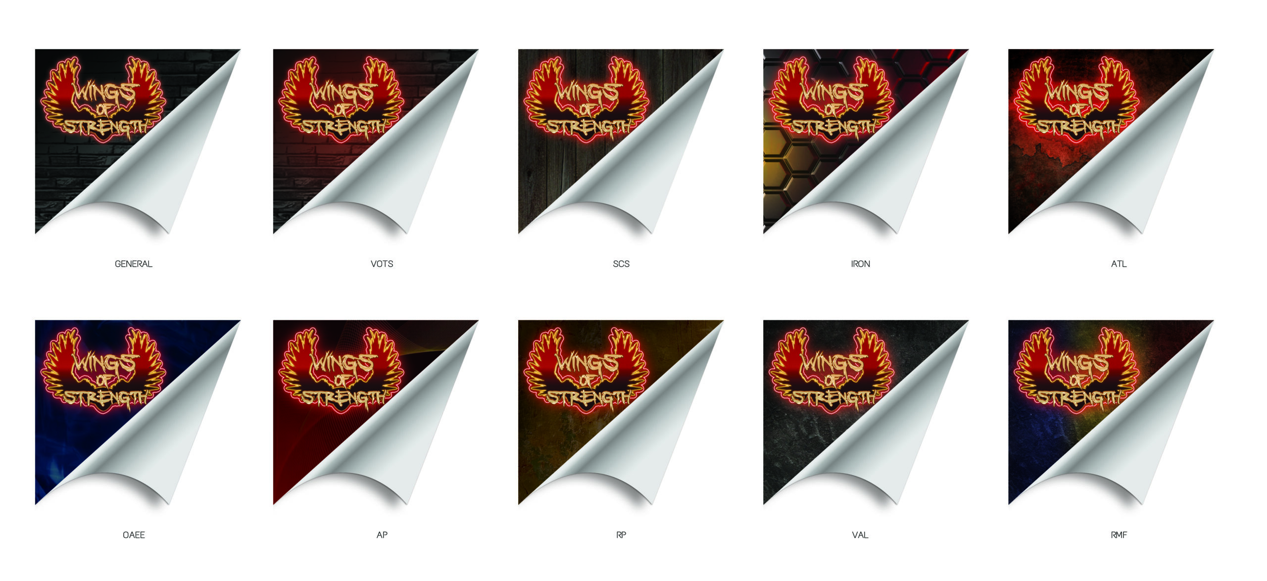
The breakthrough came from shifting the thinking away from flat branding and toward environmental presence. I explored the idea of neon signage, drawing from urban environments where light, contrast, and atmosphere create immediate visual impact. Neon does more than display information, it demands attention. That became the foundation of the system.
The existing logo was enhanced with subtle glow and illumination, increased depth and dimensionality, and controlled contrast for visibility in dark, high-energy environments. The goal was to create a version of the logo that felt alive and could integrate naturally into stage lighting, video production, and digital content without feeling applied or artificial.
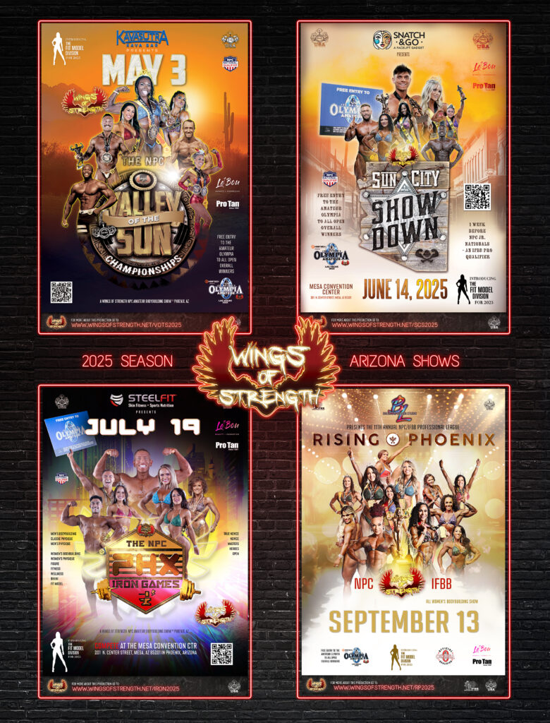
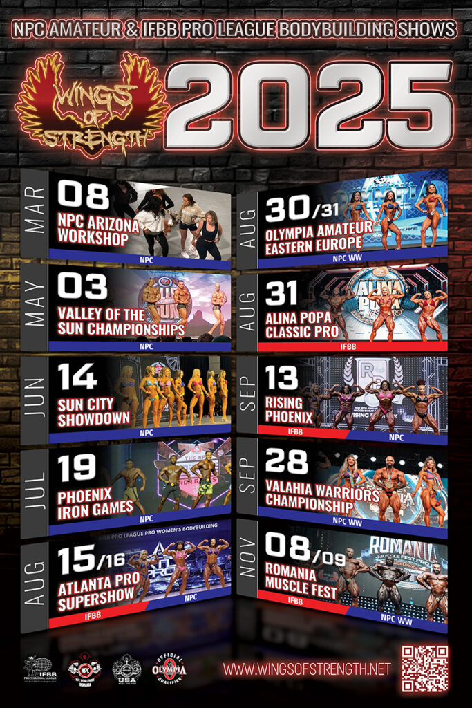
Every decision was driven by real-world use. The system was built to perform across social media, event branding, motion and video, and large-scale print. The result was a flexible identity that delivered both visual impact and practical application.
- Increased visibility in dark and high-contrast environments
- Maintained brand recognition while introducing a fresh visual energy
- Adapted seamlessly across print, digital, and motion applications
- Enhanced presence within live event and stage environments
- Established a flexible system that could scale across multiple shows
IMPACT MOMENT
The turning point came when the identity moved beyond flat design and into a dimensional environment.
Lighting, glow, and material interaction revealed something critical:
this wasn’t just a logo system. It was a scalable visual world.
From that point forward, every asset was built to exist within that system, not outside of it.
RESULT
The final identity preserved the core recognition of the Wings of Strength brand while introducing a more dynamic and contemporary presence.
The updated system:
- Elevated visual impact across all media
- Maintained consistency across multiple events and formats
- Integrated seamlessly into both digital and physical environments
Most importantly, the identity proved sustainable. It continued to be used beyond its initial rollout, showing that the approach was not only visually effective, but also adaptable and long-lasting.